This is the second part of a three-part post where I try to provide an in-depth look at the entire behind-the-scenes process of making a photo, showing exactly, step-by-step, all the way from start to finish, how I created this shot:

Part I discussed the pre-production: goals, subject matter, choosing the model and props, dealing with the limitations of the location, choice of lens and composition, and lighting set-up. If you haven’t read Part I yet, you can check it out here. This section (Part II) covers production: “chimping” my way through the shoot itself, adjusting pose, expression, composition, lighting, and exposure, and the in-camera editing process of picking the “hero” shot. Part III will talk about the post-production: RAW conversion, clean-up and correction, stylizing through the use of various filters, and more. For now, let’s get into…
THE SHOOT:
 Stacia showed up, and after doing a few basic headshots and glamour-type frames to warm up, and setting up my lights in the bathroom while she changed, she got into the tub. I decided not to get her wet until I’d gotten the lighting the way I wanted it. It’s always a good idea to keep the model’s comfort in mind, even if you risk missing a couple of great expressions while doing test shots. Modeling is more difficult than most people think, and looking out for the well-being of your subject will inevitably pay off in the end.
Luckily for me, Stacia didn’t need a lot of direction, because she immediately understood exactly what I was going for in terms of emotion and expression: startled and concerned, with a hint of fear, but not totally terrified. I wanted to leave some ambiguity as to what was going to transpire next. I took a couple of test frames to adjust the position of the key light on her face and got this on about the third attempt:

Like all of these set-up shots, this is an unedited jpeg taken straight from the camera. Not bad, I thought, when I looked at the camera’s display. I liked the way the snoot was focusing the warm light on her but leaving everything else green, but I wanted more detail visible on the gun. Later on, I decided to publish this photo, unedited, on my website, because I thought it told an interesting story, but at the time of the shoot, it wasn’t the story I was trying to tell, so I kept going. Looking back on it now, I wonder if this might have been a better direction to go in… oh well. :^)

Okay, I thought, the gun is more visible, which is good, but now she looks like she’s got a gigantic man-hand. Wide-angle lenses exaggerate the apparent distance between the foreground and the background (telephoto lenses do the opposite), particularly when you have your subject close to the edge of the frame (more about this later). While this exaggeration can be used to great effect, pulling the viewer into the photo, in this particular case it just looked bizarre. Need to have her hand away from the edge of the frame.

Okay, I thought, I like the position of her hand here, but it’s still too big. Better to keep the gun in her left hand. And her eyes are much too dark. For both this shot and the previous two, I liked the contrast and the darkness of the shadows, but I knew that I was going to be doing some extensive editing on this shot, and I wanted to have as much post-production flexibility as possible. Digital camera sensors don’t distribute image data evenly over the tonal range. Even in a well-exposed photo, a lot more information is contained in the highlights than in the shadows, which effectively means that, while editing, it’s usually easier to make bright parts of an image darker than to try to make dark parts brighter. This means keeping the exposure as close as possible to the right of the histogram without getting any unwanted blown-out highlights.
Translation: make everything brighter, but not too bright. If the screen starts blinking to notify me that parts of the highlights have become pure white, and they have no detail, then I may have gone too far, and I’ll drop the exposure slightly in the next frame, or, under certain conditions, elect to pull the blinkies back later during the RAW conversion with the highlight-recovery slider.
It’s important to note that sometimes blown-out highlights are acceptable, or even desirable. If you’re shooting against a white backdrop in the studio, or if there is a direct light source (sun, lightbulb, candle, raging inferno) or a highly reflective object (mirror, watch, jewelry, my buddy Shark’s shiny bald head) in the frame, blown-out highlights are expected and perfectly fine. In this case, however, I didn’t want any blinkies.
Okay, I thought, I like those last three shots, but even apart from the fact that I need a brighter exposure, they aren’t usable in terms of my original concept. First of all, she’s not wet. Second, the strap of her top is visible. While I want to have some ambiguity in this photo, I don’t want the mind of the viewer occupied by the question: “Why is this dry girl sitting in a bathtub with clothes on?” Time to get wet.

In my original sketch, I’d planned to leave the water running for the photo, but in practice this turned out to be, not surprisingly, a terrible plan, as the shower head sprayed all over the place if it was hanging and not held. Not the brightest idea when one’s camera is nearby, so I left the water off.
I really like her expression in this shot, but because her head is tilted, and so close to the lens and the edge of the frame, it’s heavily distorted. There’s finally some good detail on the gun, and everything’s a bit brighter overall (maybe too bright?), because even though I had dropped the overall exposure (by narrowing the aperture from f/9 to f/13), I’d also increased the output of the keylight and loosened up the snoot to widen the spread of orange light. I decided to try shutting down the aperture even more (f/13 to f/16) and tightening up the snoot.

Whoops. Pretty cool look, but way too dark for editing leeway, so I increased the flash power and loosening the snoot again to compensate:

Ok, that’s better, I thought. I’m liking the way the vertical lines of the doorframe and the horizontal line of the rim of the tub trap her into the upper-left portion of the frame. Great expression, and I’m pretty happy with the lighting and exposure level… but I wish I could see more of her hair. Let’s try hanging it out over the edge of the tub. Also, I had placed a sponge into the bottom, camera-left corner of the tub, to add another visual as well as narrative element, but her elbow is blocking it.
In terms of composition, I was somewhat limited by the location. Moving a wide-angle lens even a couple of centimeters can dramatically change your composition if you’re close to your subject, but even with my back pressed right up against the wall, essentially spooning my toilet (yum), Stacia’s face was still only about half a meter away from the camera lens, and because I didn’t want the sink or the door in the frame, I didn’t have much leeway in terms of adjusting the camera angle.
It was around this time that my Speedlite firing rate was slowing down, so I moved back to f/14, but eventually had to add a fresh set of batteries.

Great, I thought, love the way the vertical lines of her hair create an angle that mirrors the swaying background curtains. I understand that, logically, it might seem a bit odd that her wet hair is just hanging there dripping outside of the bathtub, but the fact that this doesn’t concern her does suggest that there’s something more important going on in the story, and I can further justify it by visualizing that she had to stand up briefly, reach for her gun, and then crouch back down in the tub (I’ll leave that action to your imagination.)
Unfortunately one strand of her hair is aligned with the middle finger of her free hand, making it look like she’s got some kind of mutant, Wolverine-esque claw growing out of her fingertip. I could edit it out in post if necessary, but I’d rather not have to.
The sponge is visable here, but I still need to get her right (camera-left) elbow a little bit away from the edge of the frame. I know that I’ll need to crop a little bit to fix the lens distortion, so I need more space, and I can’t move back or zoom out any further.
Ah, and I want to see Stacia’s leg. Outside from the obvious reason, if we see a glimpse of her knee, it might hint that she’s just about to spring into action, adding a bit more tension to the scene.

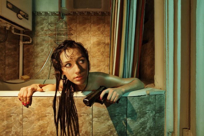
Ok, I thought, almost there. At the time of the shoot, I had decided that I wanted Stacia’s eyes to be either in the lower or upper-left rule-of-thirds point, small and vulnerable, staring camera-right upward toward the unseen danger, but this proved to be impossible due to space limitations, so I had to settle for having her face half-way between the two left rule-of-thirds points. Hopefully, this was mitigated by having her right hand, her left hand, and the lower strands of her hair combining to create a pseudo focal point at the intersection of all of these elements.
As usual, Stacia’s expression is wonderful, but her right hand is still a bit too close to the edge of the frame, and her head is too close to the shower hose. I asked her to make these adjustments and try and do everything else exactly the same as what she just did in the previous shot, and here’s what we got:

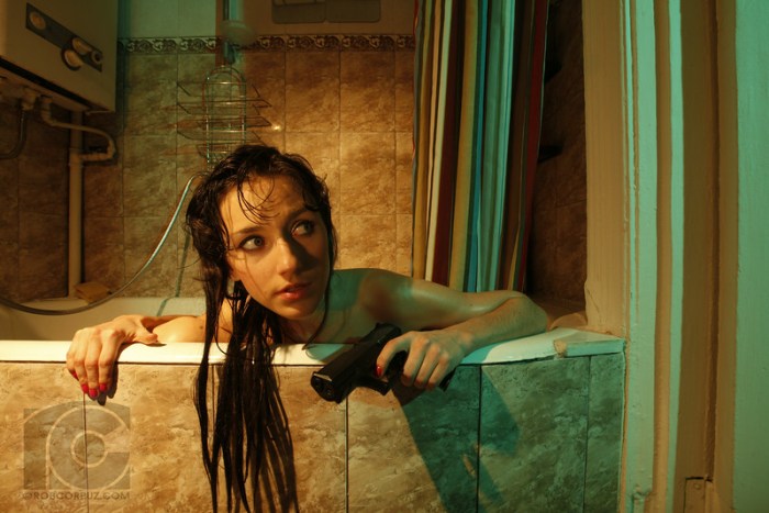
Sometimes you know immediately when you’ve just taken your “hero” shot, and while I wasn’t totally positive this was it, I did know it was the best one I’d gotten so far, and I had that little sigh of relief that you get when you know that even if everything else on the rest of the shoot goes awry, you’ve got one in the can that will work. Stacia had nailed exactly what I’d asked her to do, and arguably made her expression even better. Still, we kept going for a little while, but I never did get a shot that I liked more than this one. We even experimented with a couple of frames showing what might happen next in the story:

While this wasn’t the vision I’d originally intended, I really love the way the orange and green light blends together on her face, and she sure looks badass here. The air of concern and vulnerability in her expression has totally evaporated, replaced by the kind of cocky, self-assured look Hollywood movie posters love. At this point, Stacia told me her left arm was getting tired from holding the gun for so long, and politely asked if she could switch it back to her right hand. Even apart from the fact that the gun was lazily (and I presume unintentionally) pointed at my crotch when she asked this, I was happy to oblige.

If a Russian film version of Lara Croft ever gets made, I think I know who I’d like to see play the main role :-)!
Stay tuned for part III of this post, where I describe everything I did in post-production to get the final version of “Bath, Interrupted” you see below. Depending on what device and browser you are using, you may be able to move your mouse/cursor over the photo to see the changes made from the original, unedited hero shot. Thanks to Stacia for being such an amazing model and thanks to all of you for reading! Check out Part III here.